Graphic Design
Portfolio
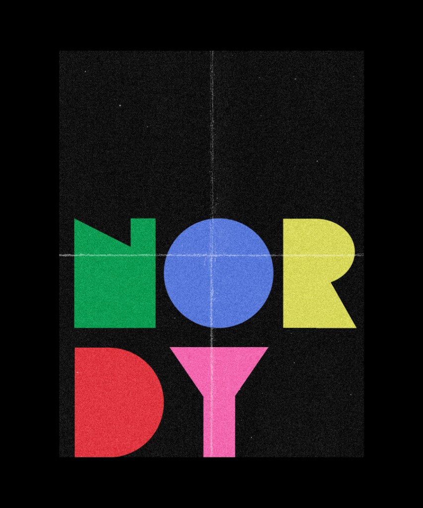
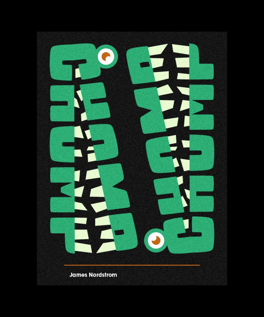
By: James Nordstrom
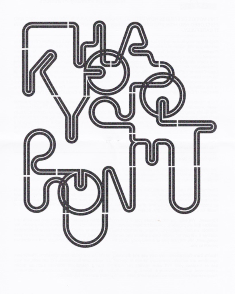
Rhythm & Rhyme
Museum of Rap History
For my Advanced Visual Design course we had been assigned to conceptualize an idea for an interactive museum. My museum was based off the idea of teaching the history of rap/hip hop music, as well as the changes in technology. I chose the name ‘Rhythm and Rhyme’ because both of these things have always represented important parts of creating rap music.
Our main objectives were to design the logo, poster promotions, and merchandise for the interactive museum. Below I will go through my thought process in creating these designs.
Logo
The idea behind the logo was to combine a boom box, and a rewind button. This is because the museum would be focusing on going back in time to show the transformation throughout the decades. I used Helvetica for the text for a clean look that would be easy to read from a far distance. The red I used in the logo was to represent passion, and excitement while the black was used for bold contrast that would bring attention to the logo.
Poster 1
For this poster I really wanted to convey a sense of rhythm. It was a bit of a simple idea, but I felt like I could find a creative way to convey that message that could grab someone’s attention. With the black & white letterforms, and the varying heights I felt like I was able to give the sense of sheet music, but also was able to keep the readability at the same time. I didn’t want this to overpower the other text in the poster, so I used red. I used red because it really sticks out when paired with black because it is on the opposite end of brightness. With all that being said I think the poster was successful.
If I was to redo this poster I would make some changes though. I would push/exaggerate the varying height of the letters even more. If I did that as well as clean the lines up a bit more, it would make it much more interesting. I also feel as if there’s no real focal point to the poster – The bold red text and the background are both fighting for your attention so you don’t quite know where to look first. A possible solution to this would be to make the ‘Rhythm & Rhyme’ text on one line giving It room to enlarge it, and moving the ‘Museum of Rap History’ to go underneath that, and choose a more interesting font. Possible something with serifs to contrast the background. That would a way to improve the hierarchy.

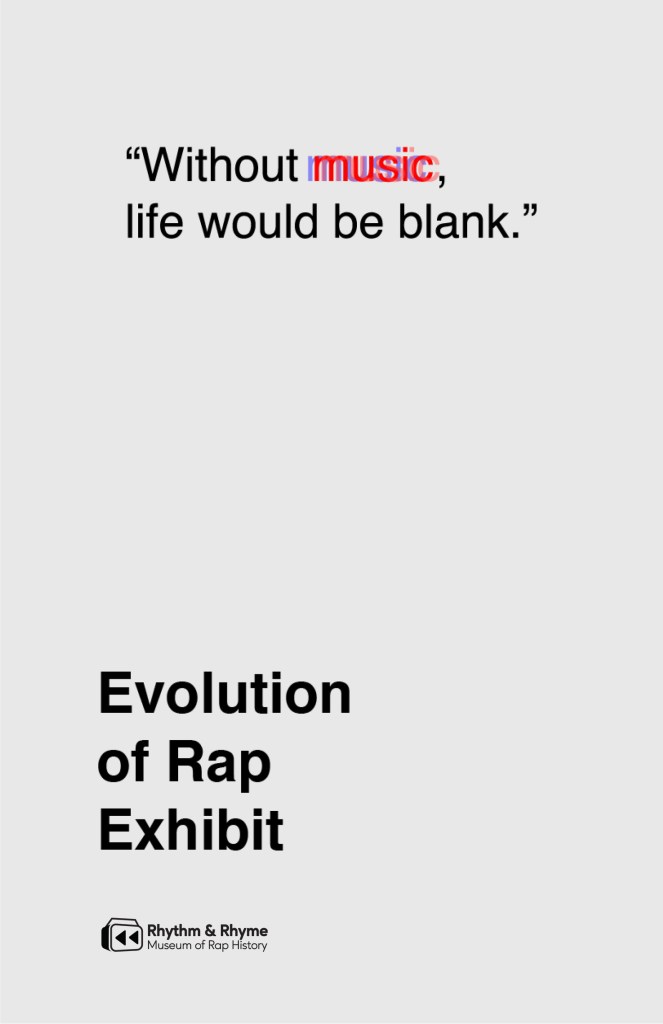
Poster 2
My second poster was a promotion for the evolution of rap exhibit that would take place in the museum. I was inspired by this Jane Austen quote “Without music, life would be blank.”. Based off of this quote I wanted the poster to be, well, mostly blank. I did this by using as much negative space as possible, and then by making the word ‘Music’ the only part of the poster with color, and motion which created my focal point. This poster is pretty simple, but I feel like it works well.
Things that I could change to make it more successful could be making the ‘Evolution of Rap Exhibit’ text smaller and less bold, and making the quote text a little larger. I think by just making these small changes it would create better balance.
Poster 3
My third poster was for the other exhibit that would be taking place in the museum. The “Create Your Own Sound” exhibit would be an interactive one where people would get to try out some of the equipment professional musicians have used throughout the years. I wanted to bring a loud and energetic feel to this poster to make the exhibit seem exciting. I achieved this by using big bold text, and a lot of sharp shapes that are pointing to the focal point. I wanted to go for a brutalist style for this poster so I emphasized the texture, and tried using expressive forms.
Some changes I would make if I redid this poster would be to choose a more expressive typeface, and try to push the use of textures/shapes even more so the poster could be even more exciting.

Merchandise
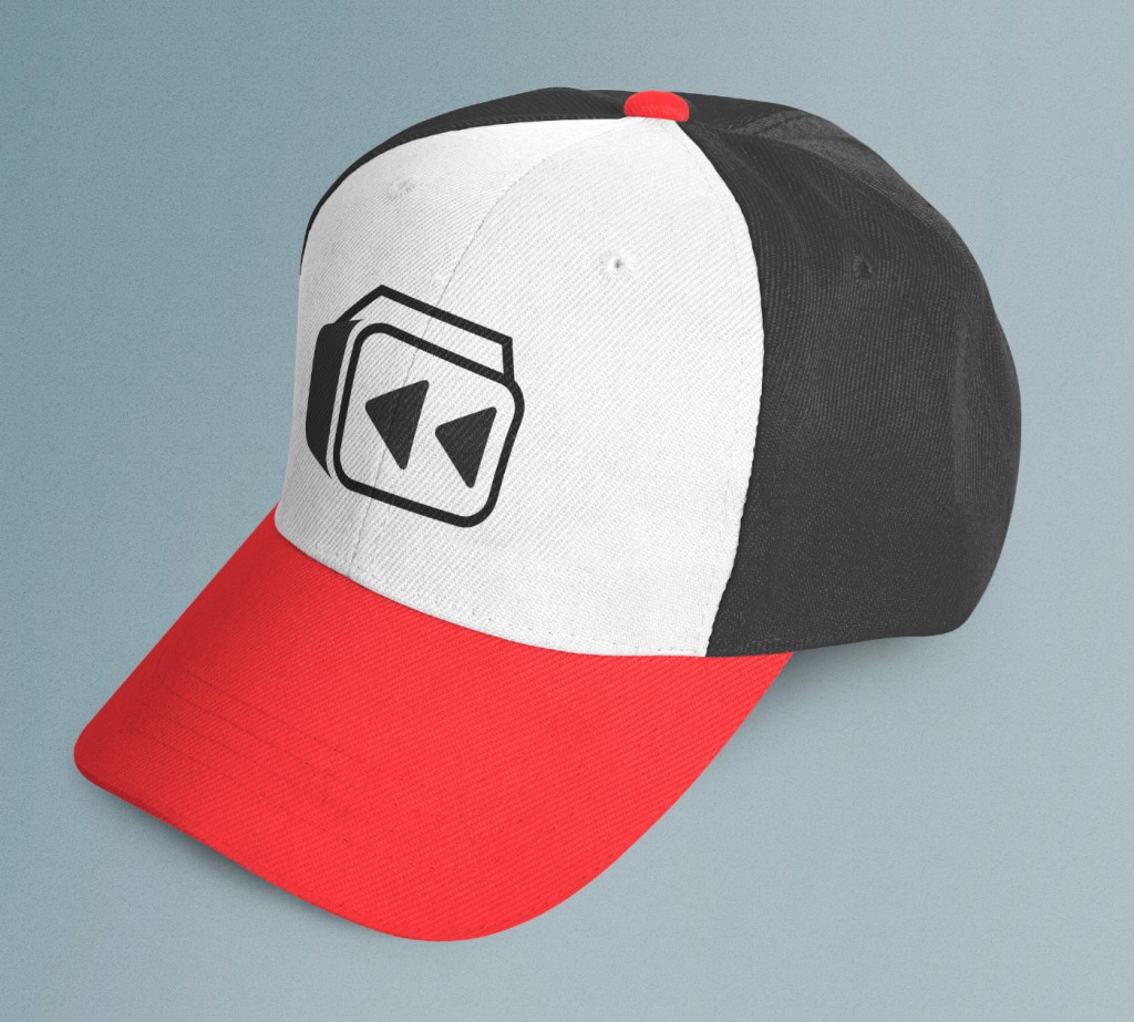
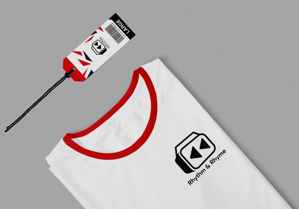
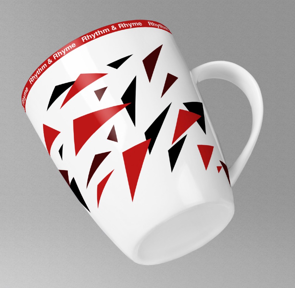
Another part of the project was to design merchandise that would be available in the gift shop. I chose some common items people would like to purchase when visiting a museum. I kept things simple with the hat, and t shirts to continue that clean look that the logo gives. The logo on the hat would be embroidered because of the past time feel it gives, and it looks much better than just printing on hats. The mug matches ‘Poster 3’ with the expressive shapes, and colors scheme creating unity between designs around the museum and the merchandise.
Professional Works
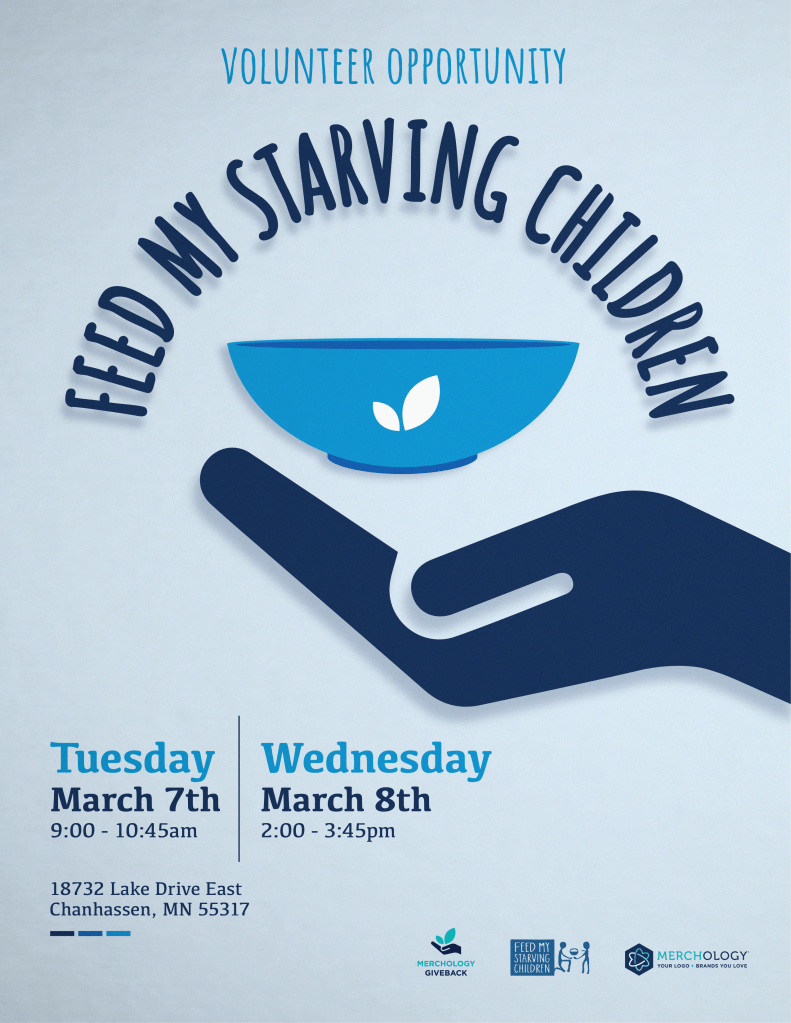
Feed my Starving Children
I volunteered to create this poster for the Feed my Starving Children volunteer opportunity held by the Merchology Giveback Team. I wanted to mix both styles of FMSC, and Merchology because I felt like they had a good contrast between them. I did that by using a type face similar to the one in the FMSC logo, and then used both the hand and leaf that are in the giveback team logo..
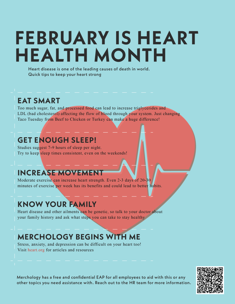
Heart Health Month Poster
I was tasked with creating an informational flyer for Heart Health Month. The toughest part was including all this important information without the flyer feeling too crowded. I used the heart in the back and the large text as an attention getter, and I grouped all the information together on a grid system. I used white dashes to separate each section so the table would feel more open, and not feel as rigid. I used a clean simple san serif font paired with times new roman so the information would be easy to read. I feel like overall it was successful in getting the information across.
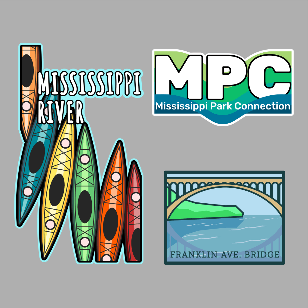
Mississippi Park Connection Logos
Me and a few other colleagues were assigned to help create logos that would go on water bottles for the picnic in the park event that’s hosted by the Mississippi Park Connection. I made 3 completely different logos, so that they had a few options to go with. The kayak logo was inspired by how popular kayaking on the river is, and I used lot of bright colors so that it would stick out from a far on the bottle. You can find the Franklin Ave. Bridge along the Mississippi river, and the photos I’ve seen of it are beautiful, so I made an illustration of that using more of the MPC colors. And the last logo was just a simple version promoting the MPC.
Personal Works
Design is not something that I just want to have a career in, it’s also something that I’m passionate about. In my free time I enjoy practicing my skills by using my design knowledge to create posters. Here are some recent personal works I’ve done just to practice my poster design, composition, and typography skills.
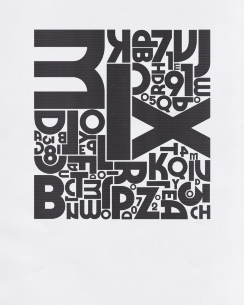
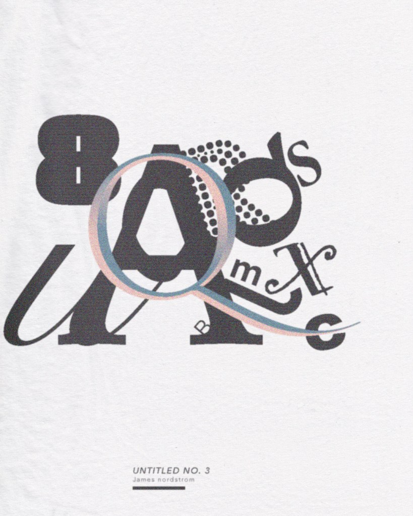
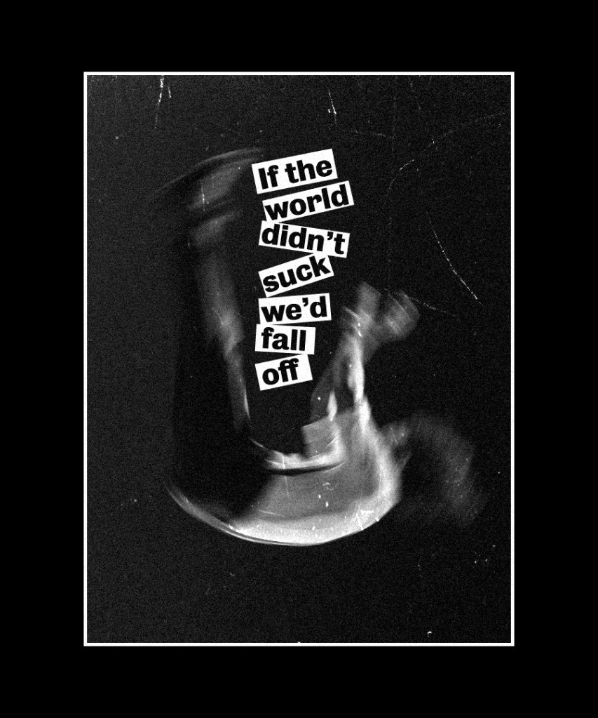
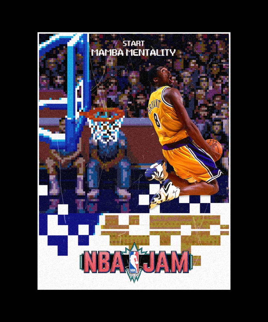
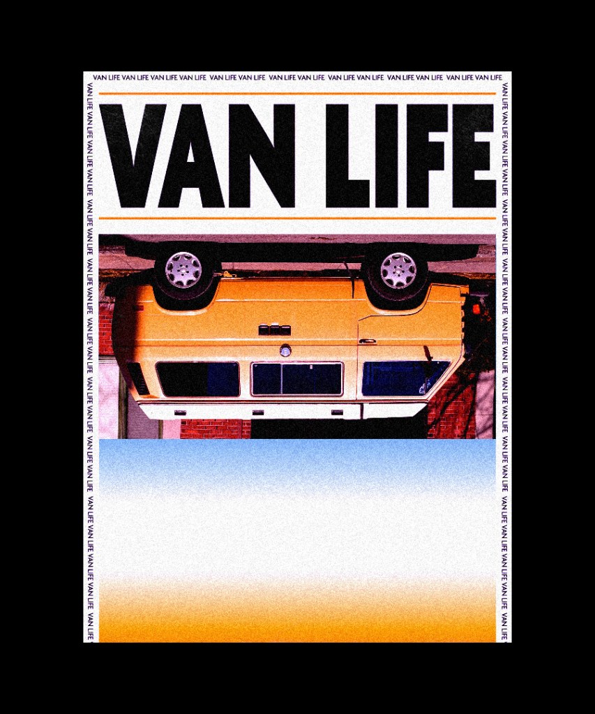
I assigned myself with creating one unique poster a day for 30 days in a row. Here are six of my favorites that I made throughout the 30 days. My main priority was to expand my typography skills.

Freelance Works
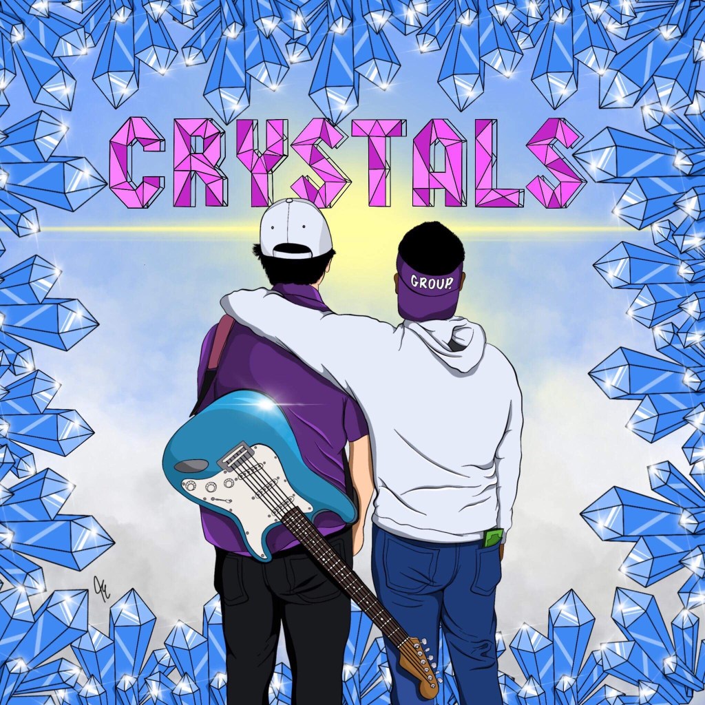
‘Crystals’
This is album art I created for a local music group in Minnesota named ‘Group.’ back in 2018. Their album was a coming of age story, and they let me know that they wanted their art to reflect a hopeful future. I showed this by illustrating them facing towards the sun, and blue skies that represents their bright future.
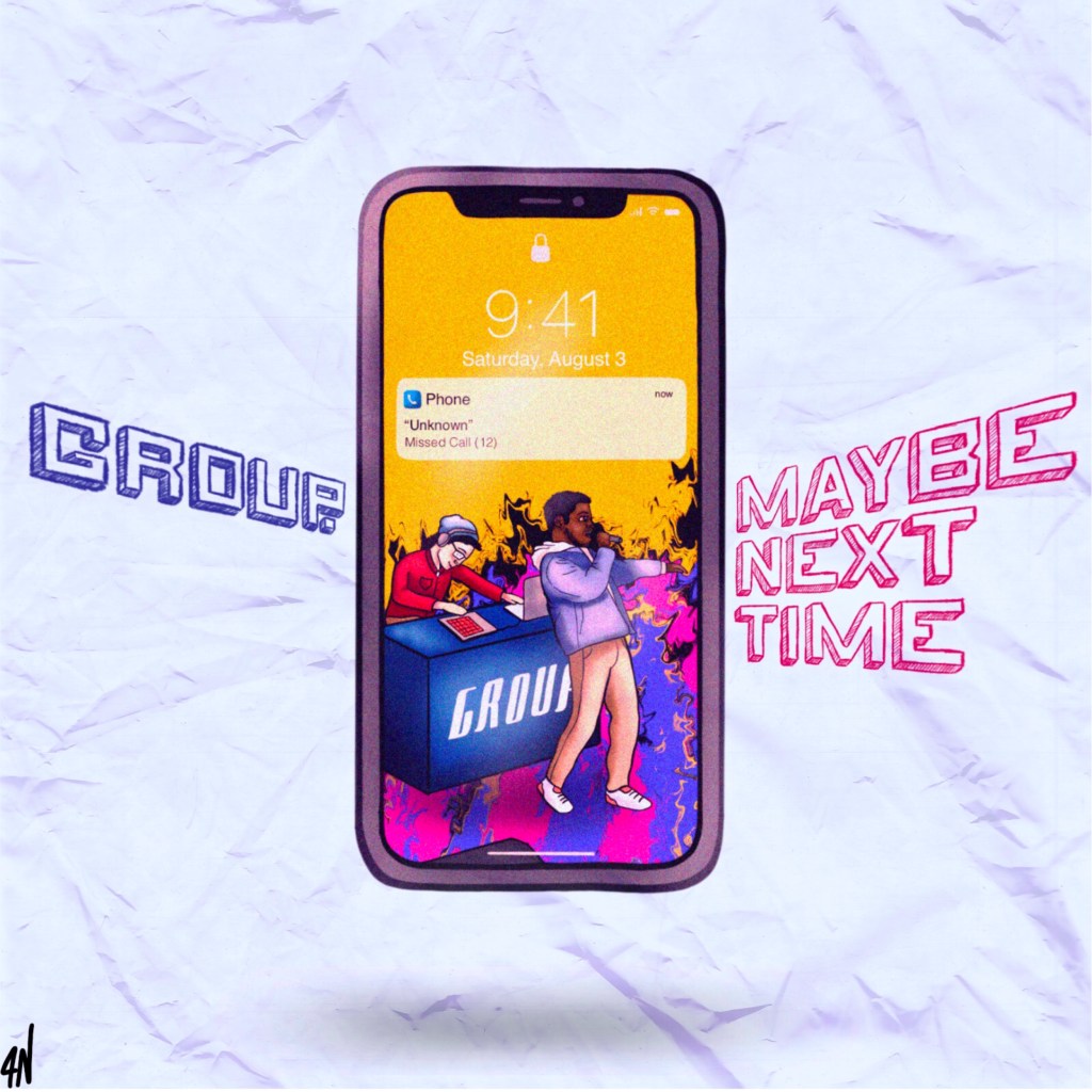
‘Maybe Next Time’
This is another album cover I designed for Group.’s second album in 2019. They just instructed me to do whatever I wanted, which is one of the most exciting things they could’ve said cause then you can really let your creativity go wild. Some design choices I made was to slant the text toward the center which leads your eyes to the main graphic of the cover, I wanted to use a lot of bright colors to convey how exciting this album is. The paper texture was to create visual interest, and depth to the art. It could also represent how the lead singer wrote most of the music sitting in class. The finished product was well done, and they were very happy with the results. Which is my top priority when working with clients.
